Revoke Redesign: Process & Thoughts
Hi, I am Richard, a Full-Stack Designer. I take care of all design aspects in projects from start to finish. You might have heard my name dropped in various Gitcoin projects. I am a user of Revoke myself, and I felt it was time for Revoke to finally look as good as the tool is useful to everybody.
I chose the color yellow in reference to traffic light colors. Yellow is the neutral signal color between green and red. The yellow symbolizes revoke's function as a guardian between contract and wallet.

The old logo, combining a shield and the Ethereum symbol, effectively represented Revoke's initial role within the Ethereum ecosystem. However, as Revoke has blossomed to support over 100 EVM chains, it was time for a logo that could encompass the new era of multi-chain compatibility.
Logo design is not about mere explanations; it's about identification. It evokes emotions rather than conveying messages. Feelings are subtle, individual, and often elusive. The new logo, a minimalist "r," is open to interpretation. It can be seen as a tetris block or a rotated hook. For most, it's simply an "r" and represents revoke's pragmatism: straightforward, functional, and adaptable. A tool that fits any task.
Some may find the logo too simple or boring. Others may miss the familiarity of the old symbol. But design follows function. A logo must work before it can be beautiful. And a good logo should be memorable. Anyone who sees the new logo can easily redraw it.
The new logo will allow Revoke to more easily expand its product suite and stands for pragmatism, clarity, and minimalism. It is a sign of maturity, humility, and a forward-thinking approach.
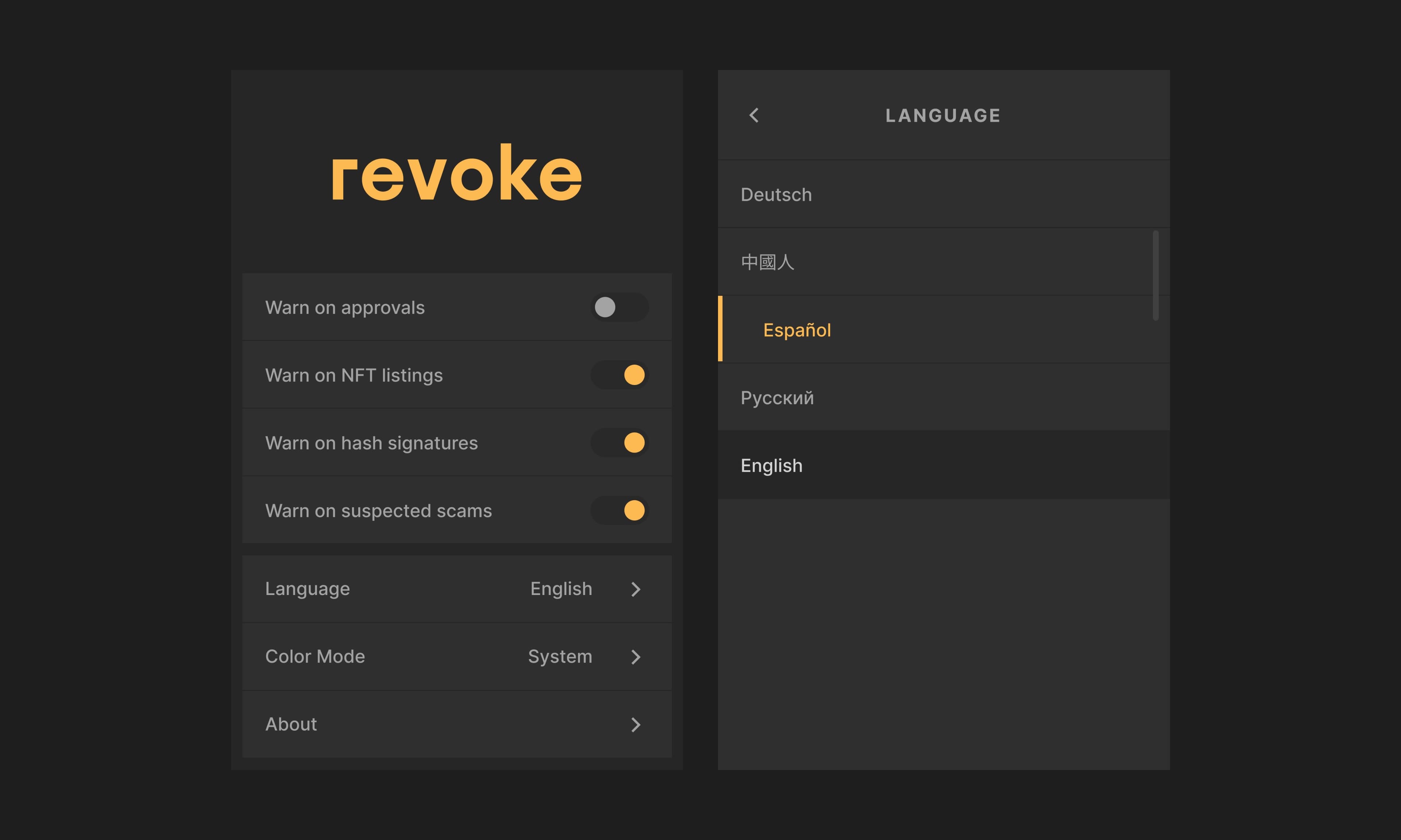
The new browser extension - now in sexy.
The old browser extension was designed very minimally and didn't offer much space for more features. Over 50% of the application consisted of the actual logo itself, and everything just seemed very quickly and efficiently cobbled together.
I designed the new extension with scalability in mind, to enable revoke keep evolving and easily adapt and integrate new features. I achieved that by creating a simple design system, optimized for that small dimensions extension should have - what nearly feels like designing for a smartphones real estate.
Working closely with Revoke to not only give the interface a face lift, but also introduce new features that makes understanding signatures, NFT transactions, and other operations easier.
Using this extension should be a joy. I haven't just redesigned a tool, we've crafted an experience. Every detail has been infused with a little extra love for detail.

Seeking a design partner who shares your vision?
Schedule a free initial consultation today to discuss your design challenges. We'll not only assess your project's needs but also ensure we're a perfect fit for each other.